

Access Economic and Financial Data Instantly with Python
A demo with the FRED API


Data releases were stressful times when I worked as an economic forecaster. You had to grab the new data points, create charts, perhaps update a model, and write up a hot take within hours of a data drop.
Having a streamlined workflow for all of this was essential.
In this post, I’m going to show you how to extract economic and financial data instantly using Python via APIs (Application Programming Interfaces).
This approach saves time by eliminating the need to manually download data files for your projects. It also unlocks opportunities to automate the data pipeline for your visualizations, analyses, and models.
A quick welcome to all the new subscribers. Many of you signed up in September, pushing the readership to 1.9k and counting. If you have any questions or topics you would like me to cover, then please let me know in the comments.
Autonomous Econ aims to empowers analysts who work with economic data by equipping them with Python and data science skills. The content aims to boost their productivity through automation and transform them into savvier analysts.
Posts will largely centre on practical guides and also include data journalism pieces from time-to-time.
Unfortunately, not all data APIs are built the same. A good API has:
a large library of data
good documentation
free to access (or a good free tier)
is well-maintained
The worst thing is using a service that ends up in the API graveyard when it’s no longer supported.
I’ll demo one API that meets these criteria: FRED (Federal Reserve Economic Data). I will also link some other noteworthy APIs at the end.
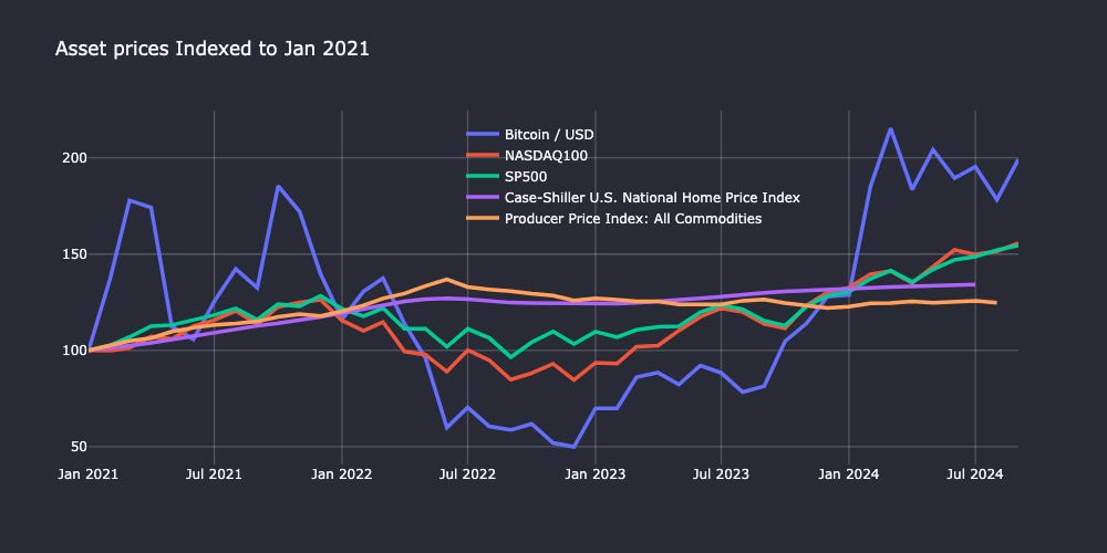
For this demo, I will take you through creating the indices plot below using data extracted only from FRED. You can follow along with this Jupyter notebook. The easiest way to run the notebook is here via Google Colab.
What are APIs and Why Use Them?
A standard way to import data for a project would be to download it from different sources, like a website or database portal, before moving it to a project for use.
Instead, you can automate data extraction by calling an API in a Python script. You could then bulk-generate a series of PDF reports or a web app with the click of a button, or schedule it using a tool like GitHub Actions (more on this in a future post).
📜 An API (Application Programming Interface) allows different software programs to communicate and exchange information. You simply send a request for information or data, and the API delivers the result.
There are APIs for all sorts of data, not just for economics and finance, e.g., X/Twitter, Spotify, and Instagram. You can do all sorts of interesting projects once you’re comfortable with using them. See this comprehensive guide on APIs if you want to learn more.
It’s true that some spreadsheet-based tools like Google Sheets and Excel can access data via APIs as well. However, if you want to get serious about making prediction models or fancy dashboards, then you need to use a scripting language like Python. Having all the steps in a workflow in a Python script also makes it transparent and reproducible.
Introducing Fred
FRED, created by the St. Louis Fed, is a database that gives you access to 800K+ U.S. and international time series data.
This includes key macroeconomic indicators on inflation, economic activity, the labor market, and much more. You can browse the catalogue here to get an idea. The data available for individual countries is also surprisingly rich, even for smaller countries like New Zealand.
There is a convenient Python package called fredapi that gives you full access to all of this data. You just need to grab an API key and you’re ready to go.
You can grab historical data for something like GDP using get_series() with just one line of Python code. All you need is the series_id, with the option to specify the observation_start and observation_end dates.
# Pull GDP data from FRED API

gdp_data = fred.get_series('GDP',observation_start='2000-01-01')
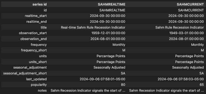
If you don’t know the series_id then you can easily search for it within the package. For example, if I want to find the Sahm Rule indicator by
, I can use the snippet below.# Search for SAHM indicator
results = fred.search('sahm')The result is a pandas DataFrame that shows key information about the series, such as frequency, the historical length of the series, and when it was last updated.
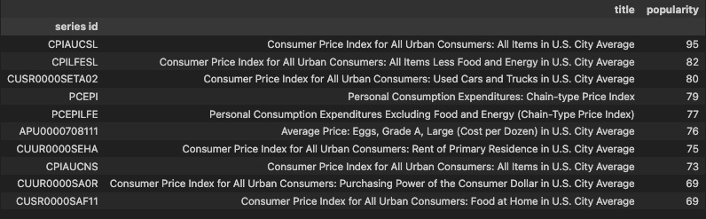
If you want to identify the most-used indicators, you can order your search by popularity. For example, you can search for the most popular Consumer Price Index measures.
# Search for inflation-related indicators

results = fred.search('Consumer Price Index for All Urban Consumers',limit=10,order_by='popularity', sort_order='desc')
Extracting the Data for the Indices Plot
For the chart, I need to extract data for the following using their respective series_ids:
Bitcoin / USD (
CBBTCUSD)Case-Shiller House Price Index (
CSUSHPISA)NASDAQ 100 Index (
NASDAQ100)S&P 500 Index (
SP500)Producer Price Index: All Commodities (
PPIACO)
First, you need to set the API key in the environment — never share this API key publicly.
# Set API key

fred = Fred(api_key='<INSERT YOUR APIR KEY>')
I will retrieve each series using a snippet like the one below. Note that the default output from get_series() is a pandas Series, and we need to convert it to a pandas DataFrame to apply other operations later on.
# retrieve house price data

house_price_data = fred.get_series('CSUSHPISA')
house_price_data=house_price_data.to_frame(name='CSUSHPISA')
...
Some of the series are daily, while others are monthly. I handle this by converting the daily indicators into monthly data using the resample() operation and taking the closing value of each month.
# Convert daily data to monthly by taking the closing value of each month

btc_data_m = btc_data.resample('M').last()
...
We can filter each DataFrame by a common start date (in this case, ‘2021-01-01’) and then combine them into one DataFrame using pd.concat().
# Filter each dataframe so start date is 2021-01-01

start_date='2021-01-01'
house_price_data_1=house_price_data.loc[house_price_data.index >= start_date]
...
# Join the dataframes
merged_df = pd.concat(
[
btc_data_m_1,
nasdaq_data_m_1,
sp500_data_m1,
house_price_data_1,
commodity_data_1,
],
axis=1,
join='outer' # ensures we have the time index of the series with the most data
)Finally, I apply a custom rebase function so that all values in each column start at 100, making the different series comparable over time.
# Rebase so the the initial value is 100

# Function to rebase columns
def rebase_columns(df):
    rebased_df = df.copy()
    for column in rebased_df.columns:
        first_value = rebased_df[column].iloc[0]
        rebased_df[column] = (rebased_df[column] / first_value) * 100
    return rebased_df

plot_df=rebase_columns(merged_df)
Now we create a quick time series plot with Plotly—the full code snippet is at the end of the post. We can see that Bitcoin outperformed traditional market indexes by doubling in value over the last 3.5 years, but it has been much more volatile!

This is just one example of what you can do with the extensive FRED API, and I’m sure you can find some data in there for your future projects as well.
If you know of any other useful or interesting APIs, drop a comment below.
Other Noteworthy APIs You Can Use with Python
World Bank: Provides development indicators, demographics, environment, and trade data.
Eurostat: Offers a wide range of data for Euro member countries.
For more detailed financial data on the crypto market, stock prices, company fundamentals, and technical indicators, here are some reliable APIs:
Most of the finance ones have free tiers, though features like intra-day price data usully require a premium subscription.
Code for the Plotly chart
import plotly.graph_objects as go

# Create a Plotly figure object
fig = go.Figure()

# Loop through each column in the DataFrame and add a trace for each column
for col in plot_df.columns:
    fig.add_trace(go.Scatter(x=plot_df.index, y=plot_df[col], mode='lines', name=col))

# Update layout for better readability
fig.update_layout(
    title="Asset prices Indexed to Jan 2021",
    xaxis_title="", # sets the xaxis title
    yaxis_title="", # sets the yaxis title
    template="plotly_dark",  # Optional: Dark theme template
    legend_title="",  # Legend title
    width=1200, # Width of plot
    height=600,# Height of plot
    plot_bgcolor="#282a36", # Sets background colour of plot area
    paper_bgcolor="#282a36",# Sets background colour of entire figure
        xaxis=dict(
        showgrid=True,  # Show grid lines for the x-axis
        gridcolor="rgba(255, 255, 255, 0.2)",  # Light gray grid lines
        gridwidth=1.3  # Increase grid line thickness
    ),
    yaxis=dict(
        showgrid=True,  # Show grid lines for the y-axis
        gridcolor="rgba(255, 255, 255, 0.2)",  # Light gray grid lines
        gridwidth=1.3  # Increase grid line thickness
    )
)

fig.update_traces(line=dict(width=3.5)) # Make lines in plot thicker

# Show the plot
fig.show()
BEA has an API as well that would be worth incorporating.
This was very helpful. Thank you so much Martin. Greetings from China.