
How to outsource your data visualization workflow to AI agents
Learn how to build a Plotly-powered AI agent that automates data visualization and creates polished, interactive charts from plain text instructions


GenAI models are now advanced enough to handle complex data visualization and data wrangling tasks.
Until recently, there was a tradeoff between code complexity and building interactive, high-quality charts. Analysts often spent hours writing and adjusting code across different libraries to become proficient enough to use day-to-day.
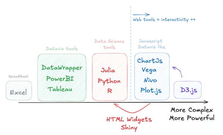
Now, coding assistant agents make it possible for analysts to move beyond Excel and the constraints of traditional BI tools, opening the door to faster and more flexible chart creation.
However, incorporating coding agents into a regular data visualization workflow still presents challenges:
Setting up a coding environment (e.g. Python) to use libraries like Plotly
Repeatedly defining chart styles and branding (colors, fonts, etc.)
Debugging the code output from Large Language Models (LLMs)
Providing detailed data descriptions and pre-processing so the LLM can interpret the dataset correctly
My goal was to create a time-series–focused plotting agent that can produce consistent, high-quality charts in a specific style — charts that look presentable on the first try. I also wanted to package it into an interactive UI so it’s easy to use in your day-to-day work on any device.
The result is an agent that uses OpenAI models and runs Python and Plotly in the background.
You simply provide plain language instructions and a CSV file, and it generates an interactive plot you can export as an image — plus it saves the code output for future use.
Here’s what I’ll cover today:
What the Plotly agent can do
The tricks to making it work
Bonus for paid subscribers: access to the full code, including the detailed prompt behind it, so you can adapt it to build your own custom plot agent
Autonomous Econ is a newsletter that empowers analysts working with economic and business with easy-to-follow Python+GenAI tutorials that deliver big results.
Subscribe and join 4k+ others to work smarter through automation and solve problems that your colleagues can’t.
Get access to my Python for Econ Starter Pack site when you sign up. It includes my favorite educational resources for Python applications like dashboards, machine learning, web scraping, and GenAI.
What the Plotly Agent does
Essentially, any chart you can find in the Plotly gallery can be created by the agent.
I opted for Plotly because it delivers powerful interactive visualizations right out of the box (see my previous post). Plotly charts can also be easily embedded into websites or web apps without the need to work with JavaScript-based tools.
You can combine data transformations or filtering instructions along with a description of your plot.
Here’s an example using a dataset on New Zealand migration:
# Instructions to Plotly Agent
- Filter for the top 6 Citizenships with the highest net inflows or outflows
- Exclude regions or groups not specific countries (e.g., ‘Asia’, ‘Non-New Zealand’)
- Calculate the 12-month moving sum of count for each direction type and citizenship
- Plot a facet time series plot (2x3) with:
- Lines for 12-month departures and arrivals
- Shaded area between the two lines labeled as net
- Exclude data for values of 0 at the beginning of the time series
- Use a single legend for all plots
- Ensure y-axes have the same min and max range in each facet plot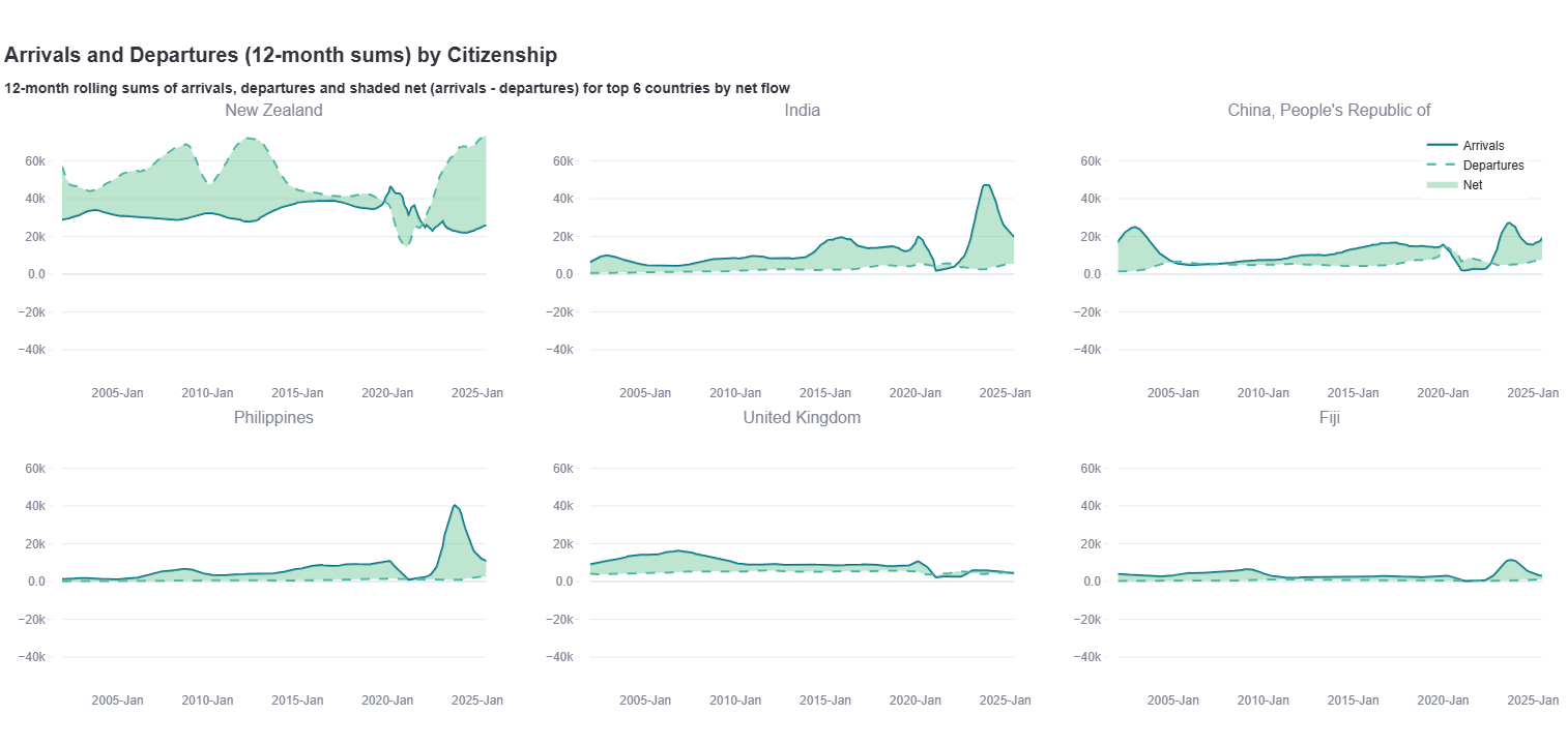
Below are a few additional plots I created with the agent using the same dataset.
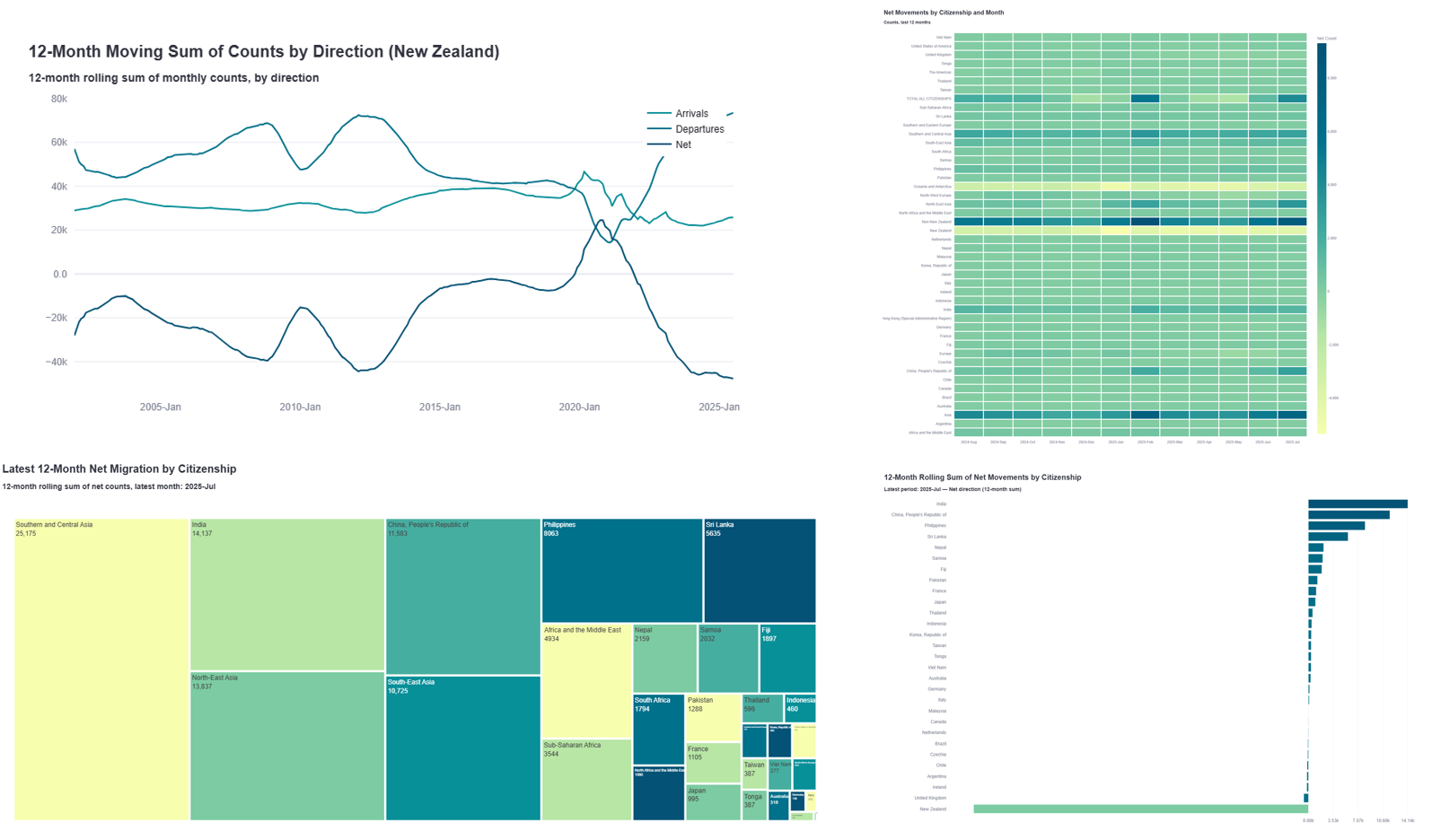
For a first prototype, it works quite well, though the accuracy and speed can definitely be improved.
You can test the agent yourself here and see how it handles your own datasets or use the demo dataset that’s there by defualt.
Note: you’ll need an OpenAI API key to run it (get one here). On average, each chart costs less than 1 cent to generate.
A few best practices I found when prompting the agent:
The more precise your instructions, the more likely the chart will meet your expectations.
The agent currently has no memory, so if you want to refine a plot, simply paste the code output and build on it with an updated prompt.
GPT-5 Mini offered the best performance-to-cost ratio, and I would use it as the default. Flagship models like GPT-5 are usually overkill and tend to produce convoluted code.
For basic time series plots, GPT-4 Mini was both sufficient and fastest.
What makes it work
My goal was to prototype an agent that produces dependable charts with a consistent look, tailored for time-series data, and smart enough to fix itself. At the same time, I didn’t want to use a complex agent framework (like React-based or tool-heavy setups).
PlotlyAgent uses a simple yet effective “analyze → generate → execute → fix” prompt-chaining workflow.
The code is built around three core components working together:
Analyze and explain the data – identify column names, data types, and structure
Guide the LLM – provide detailed, structured instructions (the system prompts do most of the heavy lifting)
Execute and auto-fix – run the code and automatically correct errors when they occur
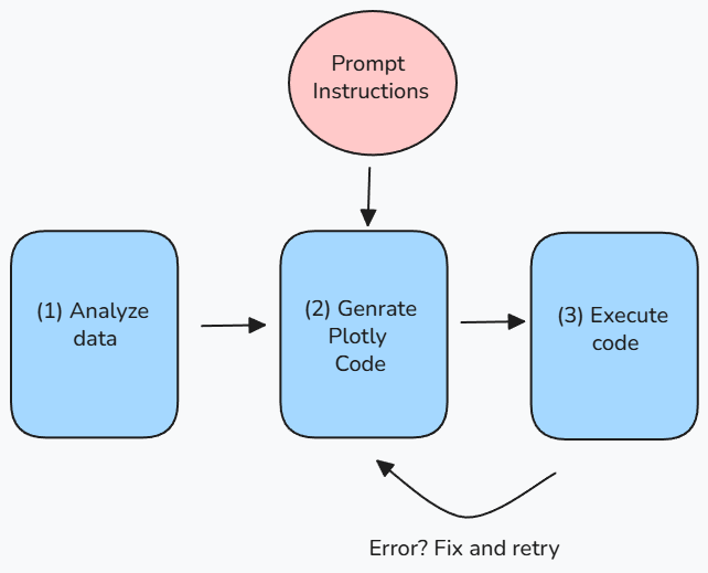
(1) Data Analysis Layer
Before generating any code, the agent first analyzes your data, including column names, data types, and other details, and then uses this information in the code generation prompt (step 2).
# Python function used by PlotlyAGent to analyse data
def analyze_data_structure(df):
return {
“shape”: df.shape,
“columns”: list(df.columns),
“dtypes”: df.dtypes.to_dict(),
“datetime_columns”: [col for col in df.columns if is_datetime(df[col])],
“sample”: df.head(3).to_dict()
}
(2) Code Generation with Detailed Prompts
The real “secret sauce” is in the prompt engineering.
Instead of simply saying “make a nice chart”, we provide the LLM with a detailed 200+ line system prompt that covers:
Exact formatting rules: font sizes, colors, title structure
Data handling: how to process datetime columns and handle missing values
Chart-specific requirements: e.g., “never add markers to line charts”, “never use range sliders”
Output format: must return a function named
create_plot(df)that outputs a Plotly figure
Here’s a simple example:
PLOTLY_GENERATION_PROMPT = “”“
You are an expert data visualization specialist.

USER INSTRUCTIONS: {user_instructions} # from chat interface
DATA STRUCTURE: {data_analysis} # from step 1

REQUIREMENTS:

- Main title: 20px, left-aligned
- Subtitle: 14px
- Use this exact color palette: [#F7FEAE, #B7E6A5, ...]
- For line charts: mode=’lines’ only, NOT ‘lines+markers’
...

Return only this code:
def create_plot(df):
# Your code here
return fig
“”“
Python coding is a highly sought-after skill, no matter what industry you’re in. It’s excellent for automation and integrates smoothly with the wider data science and LLM ecosystem. But Python also has a vast library of over 100,000 packages, which is why I put together a guide on the essential tools and resources for working with economic, financial, and business data. Check it out below.

(3) Execution & Automatic Error Recovery
If the code fails, for example because of a wrong column name or a syntax error, it won’t stop there. The error message, original code, and data structure are sent back to the LLM, which then fixes the issue. It gets two retry attempts before stopping.
def create_plot(csv_path, instructions):
  # 1. Load and analyze data
  df = load_csv_data(csv_path)
  data_analysis = analyze_data_structure(df)

  # 2. Generate code
  code = llm.generate(prompt=PLOTLY_GENERATION_PROMPT.format(
      user_instructions=instructions,
      data_analysis=data_analysis
  ))

  # 3. Execute with automatic retry
  for attempt in range(max_retries):
      try:
          exec(code)  # Run the generated code
          fig = create_plot(df)
          return fig  # Success!
      except Exception as error:
          # 4. Fix the code using the error message
          code = llm.fix_code(
              original_code=code,
              error_message=str(error),
              data_analysis=data_analysis
          )

  # Failed after retries
  raise Exception(”Could not generate working plot”)
The PlotlyAgent is not an agent in the strict sense, since it doesn’t call external tools (such as web search or document retrieval). Instead, it uses an internal workflow to understand the dataset and correct itself autonomously.
Some potential extensions for future versions include:
Retaining memory across a conversation so users can iteratively adapt the code they’re working within a session.
Connecting to Model Context Protocol (MCP) tools to access databases, data processing functions, and internal documentation (like a company chart style guide) can improve speed and cost-efficiency compared to loading everything into one large context.
Using a more advanced agent framework, such as reasoning agent (ReAct), instead of relying on an explicit error debugging prompt to help the agent complete its goals.
Key takeaways for anyone starting to build a charting agent
Be obsessively explicit in prompts. LLMs won’t follow chart design conventions unless you spell them out.
Build robust error recovery early. Code execution will fail; plan for automatic retries with context or use a ReAct-style framework.
Keep the architecture simple at first. Direct LLM calls with retry loops can be sufficient for focused tasks and are more transparent than complex agent frameworks. Starting simple reveals the obvious gaps you can later address with more advanced tools.
Consider upgrading to a paid subscription and expensing it through your work—it's a great motivator for me to keep investing energy into these posts.
The core of my articles is free to read, but paid subscribers get exclusive perks—bonus code templates and in-depth explainers designed to set your work apart.
Bonus: Get access to the full code
Paid subscribers can access the complete code repository below.
The full code gives you everything you need to:
Access the full prompt that powers the PlotlyAgent and see exactly how the workflow and logic are structured
Build your own charting agent for your organization and learn how to deploy it to Streamlit, step by step
Follow detailed instructions designed specifically for Python beginners and non–computer scientists
Keep reading with a 7-day free trial
Subscribe to Autonomous Econ to keep reading this post and get 7 days of free access to the full post archives.