
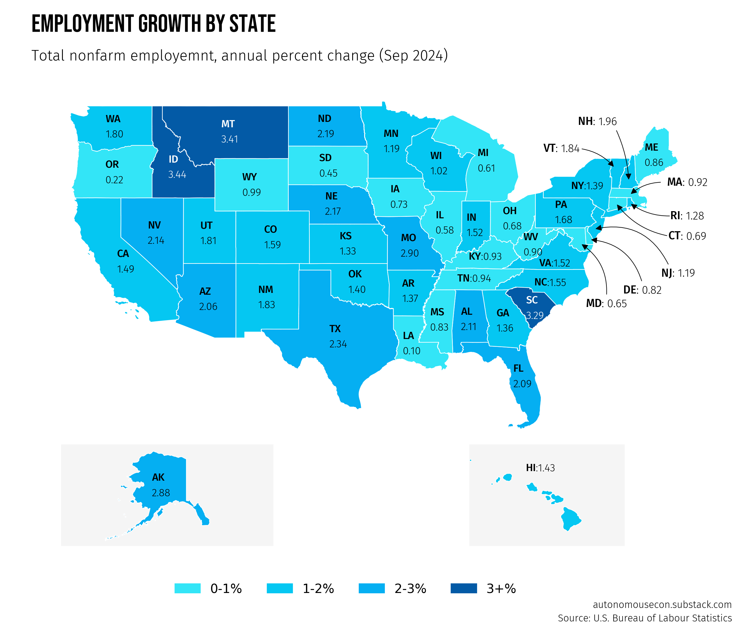
The essential guide to turn data into maps with Python
including design hacks that 90% of tutorials leave out

Trying to build maps from data is not an easy endeavor. You’ll encounter weird file types, numerous tools to navigate through, and customizations that can be tricky.
Despite the challenges, maps are universally engaging, perhaps because they’re so easy to interpret. Whether we like it or not, data analysts should know how to include them in their toolkit.
Without these skills, you’ll find yourself relying on paid software or relying on that friend who’s a GIS analyst. I was blocked by the same obstacles years ago as an economist when attempting map visualizations. The good news today is that Python provides versatile and accessible tools to build maps like the one above.
In this guide, I’ll introduce key building blocks you can adapt to design a geo-map visualization for any part of the world.
I had a hard time finding a tutorial that covered all the design hacks that actually make maps impactful—things like custom legends, annotations, and fonts.1 So I’m compiling the most important tricks here so that it will be the only guide you need.
Follow along with this notebook in your browser and reuse it for your future maps.
Autonomous Econ aims to empower analysts who work with economic data by equipping them with Python and data science skills.
Posts will largely center on practical guides but will also include data journalism pieces from time to time.
Subscribe and join 2.6k+ others to work smarter through automation and become a savvier analyst.
What are choropleth maps?
The most common type of map for data visualizations is the choropleth map. This is a type of map that uses different colors or shades to show the variation of a particular data value across geographic areas (e.g., states or countries).
Choropleth maps are easy to interpret, but they are not without flaws. Regions with larger land masses can appear to have an outsized visual impact relative to what the underlying data suggests. A common example is election maps, where large states seem to have a disproportionate influence on election results.
There are other types of maps to reduce visual bias, like hexbin plots and bubble plots. However, these can be more challenging to produce, and it may be difficult to source the necessary geographical files to create them.
In the end, choropleth maps are the simplest to make and the easiest for audiences to understand. If you are concerned about visual bias, consider using a different chart type altogether or supplementing the choropleth map with additional information.
Shape files vs Geojson files
A shapefile is a popular file format used to store geographic data, such as the boundaries of countries, cities, or natural features like rivers. Although it appears as a single map, it’s actually made up of several separate files that work together to display both the shapes and details of each area. For this reason, shapefiles can be a bit difficult to share; i.e., you need to zip them.
The most important thing to remember when reading a shapefile for visualizations is that you always need the other files to be present in the directory where the shapefile is being called from.
GeoJSON files are another type of format that stores all spatial and attribute data in a single, easily shareable JSON file.
Either way, you can read both files and create visualizations easily with GeoPandas. The only difference is that shapefiles are easier to find from official sources2 than GeoJSON files. You can also convert one to the other with tools like Mapshaper.
A basic static choropleth map with GeoPandas and Matplotlb
I will be focusing on static choropleth maps in this tutorial using GeoPandas and Matplotlib. I’m starting with a static map rather than an interactive one for two reasons.
First, interactivity typically places more burden on the reader to extract insights, whereas a static map places responsibility on the creator to convey the key messages. Interactivity should be a tool for the audience to dig deeper if they choose, rather than the default choice.
Secondly, Matplotlib allows for more customization, which is essential for making maps clear and engaging.
(1) read the data
As mentioned earlier, you can try out this template with this notebook or checkout the GitHub repo. I’ll cover the most important parts of the code rather than go line by line.
First, load your employment data from a CSV file and your geographic data (U.S. state boundaries) from the shapefile.
# Load employment data
employment_data = pd.read_csv("data/employment_state_apc_20240901_pivot.csv", index_col=0)

# Load GeoDataFrame
gdf = gpd.read_file("data/tl_2023_us_state.shp")

# Merge data
data = gdf.merge(employment_data, how="inner", left_on="STUSPS", right_on="State")
In the GeoDataFrame (gdf), columns like INTPLAT (latitude), INTPLONG (longitude), and geometry define the shapes of the areas.
The employment dataset includes the percent change from the same month of the previous year for each state.
We can merge two datasets using the state abbreviations as the common column.
(2) a simple map plot
To create a simple map of U.S. state boundaries, first set up the plotting area with plt.subplots(). Use gdf.plot() from GeoPandas to plot the geographic boundaries. There is an obvious problem with the basic plot: Alaska and Hawaii are awkwardly placed in their actual locations.
fig, ax = plt.subplots(figsize=(10, 6))
gdf.plot(ax=ax)
ax.set_xlim(-200, -50)
ax.set_ylim(0, 80)
plt.show()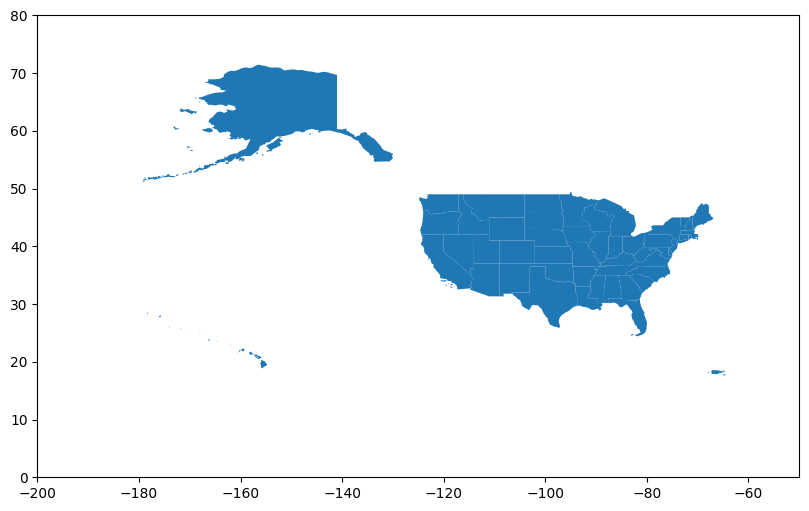
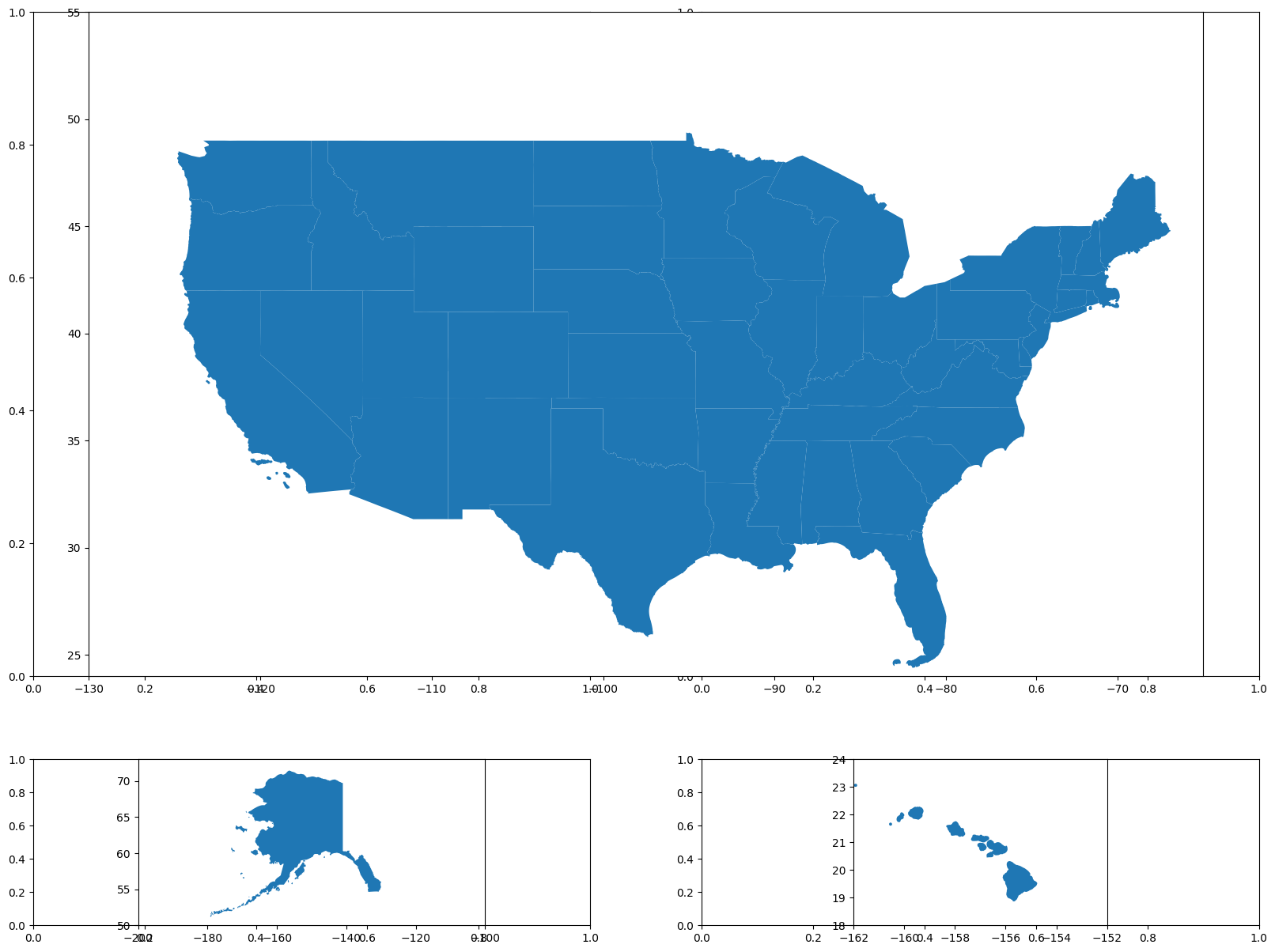
(3) use subplots to rearrange Alaska and Hawaii
To create a clean, multi-panel map with the mainland U.S., Alaska, and Hawaii separated, start by defining a 2x2 grid layout. Use gridspec_kw to customize the height and width ratios, giving more space to the mainland map.
For the mainland U.S., I plot it across the entire top row (setting colspan=2) and adjust the x- and y-axis limits to focus on the continental area. In the bottom-left cell, I plot Alaska, setting x- and y-axis limits to fit it neatly in its panel. I then do the same for Hawaii in the bottom-right cell.
...
# Define the figure and subplot layout
fig, ax = plt.subplots(2, 2, figsize=(20, 15), gridspec_kw={"height_ratios": [4, 1], "width_ratios": [1, 1]})

# Plot the subplot for mainland US
ax_main = plt.subplot2grid((2, 2), (0, 0), colspan=2, fig=fig)
data[data['STUSPS'].isin(['AK', 'HI']) == False].plot(ax=ax_main)
ax_main.set_xlim(-130, -65)
ax_main.set_ylim(24, 55)

# Plot the subplot for Alaska
ax_alaska = plt.subplot2grid((2, 2), (1, 0), fig=fig)
data[data['STUSPS'] == 'AK'].plot(ax=ax_alaska)
ax_alaska.set_xlim(-200, -100)
ax_alaska.set_ylim(50, 73)

# Plot the subplot for Hawaii
ax_hawaii = plt.subplot2grid((2, 2), (1, 1), fig=fig)
data[data['STUSPS'] == 'HI'].plot(ax=ax_hawaii)
ax_hawaii.set_xlim(-162, -152)
ax_hawaii.set_ylim(18, 24)
...
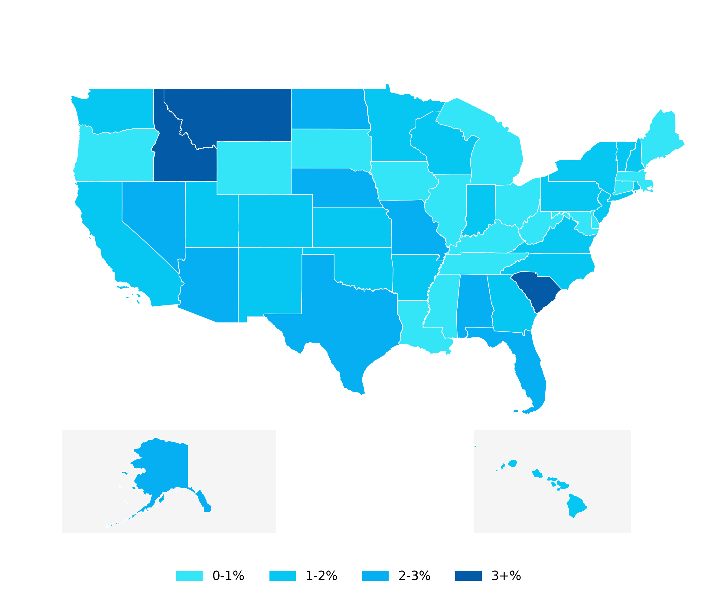
(4) choose a colour pallette and bin the data
Color palettes are very important in maps to make patterns clear to the reader. For ordered data like employment growth, it’s best to choose a sequential color palette rather than a qualitative one. I highly recommend using PyPalette to get the hex codes that work together for your color palette.
It is best to bin the data even if it is continuous, as this makes the legend much easier to read. To do this, we need to bin the data we want to plot, “apc_20240901,” using pd.cut() and create a “binned” column. We can then take the hex codes from our palette and map them to each bin with a dictionary {}.
...
# Add a binned column based on specified ranges
data["binned"] = pd.cut(
    data["apc_20240901"],
    bins=[0, 1, 2, 3, float("inf")],
    labels=["0-1%", "1-2%", "2-3%", "3+%"],
)
# Define custom colors for each bin
color_mapping = {
    "0-1%": "#33E5F7FF",
    "1-2%": "#05C7F2FF",
    "2-3%": "#05AFF2FF",
    "3+%": "#035AA6FF",
}
...
(5) plot the binned data with custom color mapping
To plot the data with custom colors and axis limits, I define a function, plot_with_legend(), that accepts the data, axis, and axis limits.
...
def plot_with_legend(data, ax, xlim, ylim):
    data.plot(
        ax=ax,
        column="binned",
        color=data["binned"].map(color_mapping),
        edgecolor="white",
        linewidth=0.5,
        legend=False,  # Disable automatic legend
    )
    ax.set_xlim(xlim)
    ax.set_ylim(ylim)
...
# Plot mainland US
ax_main = plt.subplot2grid((2, 2), (0, 0), colspan=2, fig=fig)
plot_with_legend(contiguous_us, ax_main, xlim=(-130, -65), ylim=(24, 55))
...
It will plot the data on the specified axis, using the "binned" column and apply the defined color scheme (via color_mapping). It also sets edgecolor to white and linewidth to 0.5 for clear state boundaries.
We can use this function to plot the mainland U.S., Alaska, and Hawaii in each subplot, using the same axis limits as before.
(6) create the legend based on the custom colour mapping
To create a custom legend, start by defining legend_handles, a list of patches where each color-label pair from color_mapping is represented as a colored square with its label. Then, add a legend to the figure using fig.legend(), setting handles=legend_handles to include each patch.
...
legend_handles = [
    mpatches.Patch(color=color, label=label) for label, color in color_mapping.items()
]

fig.legend(
    handles=legend_handles,
    loc="lower center",
    bbox_to_anchor=(
        0.5,
        0.02,
    ),  # Position the legend at the bottom center of the figure
    ncol=len(color_mapping),  # Arrange items in a single row
    frameon=False, # remove the box around the legend for a clean look.
)
...
After steps (4)-(6) and removing the axes we get the plot below. I also added a background color to Alaska and Hawaii to indicate that they are cutouts.
...
# remove the axes
for ax in fig.axes:
    ax.set_axis_off()
...
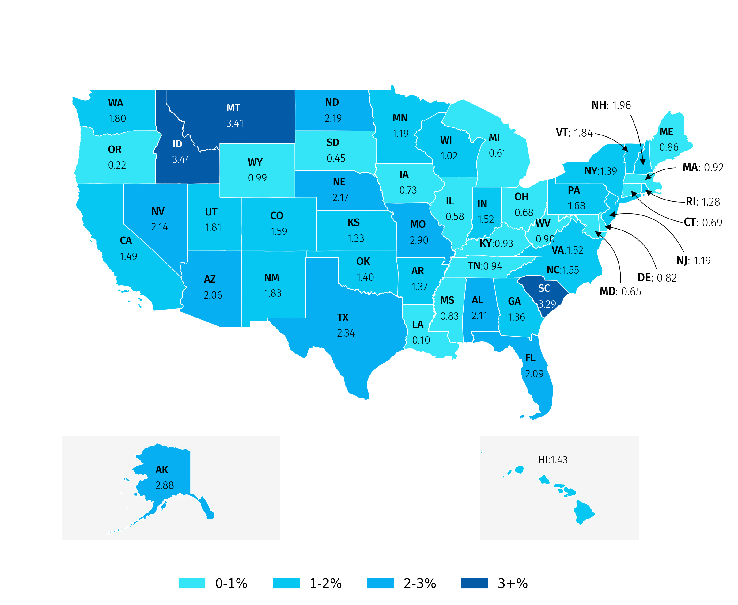
(7) load fonts and add annotations
We can use the pyfonts package to load custom fonts from the Google Fonts repository and feed these into our annotation and text objects.
...
font = load_font(
"https://github.com/dharmatype/Bebas-Neue/blob/master/fonts/BebasNeue(2018)ByDhamraType/ttf/BebasNeue-Regular.ttf?raw=true"
)

other_font = load_font(
"https://github.com/bBoxType/FiraSans/blob/master/Fira_Sans_4_3/Fonts/Fira_Sans_TTF_4301/Normal/Roman/FiraSans-Light.ttf?raw=true"
)
...
To place annotations like state names, we need the central coordinates of each state, obtained using its centroid. The code below switches the map to a layout that makes calculating each state’s centroid more accurate. Then, it converts these points back to the original layout so you can easily place labels correctly on the map.
...
# Project the data to EPSG:5070 and calculate centroids.
data_projected = data.to_crs(epsg=5070)
data_projected["centroid"] = data_projected.geometry.centroid

# Project centroids back to original CRS
data["centroid"] = data_projected["centroid"].to_crs(data.crs)
...
We can use a function, annotate_states(), that adds state names for each subplot using the centroid coordinates. It also includes the data values, so the reader doesn’t have to constantly refer back to the legend.
ax_text() is a module from the highlight-text package that simplifies adding colors, shading, and bolding to fonts in Matplotlib.
...
# Function to annotate states
def annotate_states(geo_df, ax, value_col):
    states_to_annotate = list(geo_df["STUSPS"].unique())

    for state in states_to_annotate:
        # Get the centroid coordinates and rate for each state
        centroid = geo_df.loc[geo_df["STUSPS"] == state, "centroid"].values[0]
        x, y = centroid.coords[0]
        rate = geo_df.loc[geo_df["STUSPS"] == state, value_col].values[0]

        # Add the annotation
        ax_text(
            x=x,
            y=y,
            s=f"<{state.upper()}>:{rate:.2f}",
            fontsize=8.5,
            ha="center",
            va="center",
            font=other_font,
            color='black',
            ax=ax,
            highlight_textprops=[{"font": other_bold_font}],
        )
...
# Example useage
annotate_states(alaska, ax_alaska, value_col="apc_20240901")
...
This is what we get after after applying annotations to each plot.

(8) add annotations with arrows
After adding annotations based on the centroids, you may notice that text overlaps in small states. To fix this, you can place the text next to the map with an arrow pointing to the relevant state.
To add a highlighted annotation with an arrow, I created a function, annotate_state_with_arrows(), that uses the drawarrow package. You can specify tail_position and head_position to control the arrow’s start and end points, and adjust text_x and text_y for the label’s position. Use radius to control the arrow’s curve. It requires a few iterations to get the label and arrows exactly where you want.
...
# Annotate NH State
annotate_state_with_arrows(
    data,
    fig,
    state_code="NH",
    column_name=column_to_plot,
    tail_position=(0.8, 0.73),
    head_position=(0.815, 0.65),
    text_x=0.78,
    text_y=0.74,
    radius=-0.1,
)
...
We can also make small adjustments to the centroid coordinates for annotations that need fine-tuning and set the font color to white for states with growth above 3%.
(9) add text elements
Finally, we can add different text elements, such as a heading, subheading, and source, using the code snippet below.
...
# title
fig_text(
    s="Employment growth by State",
    x=0.15,
    y=0.9,
    color=text_color,
    fontsize=20,
    font=font,
    ha="left",
    va="top",
    ax=ax,
)
...
I do want to give a shoutout to the Python Graph Gallery, who have an extensive gallery of map examples in R and Python.
US: US Census Bureau: https://www.census.gov/cgi-bin/geo/shapefiles/index.php
Europe: Eurostat (https://ec.europa.eu/eurostat/web/gisco/geodata)
New Zealand: datafinder.stats.govt.nz
This is very useful, thank you!
Amazing man.