


Yes, Python charts can look great— here’s how
5 python packages for designing professional, on-brand charts with matplotlib.

I enjoy creating data visualisations to tell a good story, but Matplotlib can be finicky — especially when you need publication‑ready plots or need to match an organisation’s design template. When you're up against a deadline or deep in analytical work, spending hours tweaking plots can feel like a huge time suck.
Still, Matplotlib is often necessary when you're automating reports, running analyses, or building dashboards in Python. It certainly beats charting in Microsoft Excel.
Below, I’ll walk you through 5 Python packages that make it easier to produce prettier, annotated, and on‑brand Matplotlib charts — with a lot less friction.
Pro tip: Load the package docs into any code assistant (ChatGPT, Claude, Cursor) while designing your next plot. Then save your design as a template so you don’t have to build from scratch every time.
A quick shout out to Joseph Barbier for creating most of these helpful tools. If you need a good primer on Matplotlib check out this guide.
Autonomous Econ is a newsletter that empowers economists and data analysts with easy-to-follow Python+AI tutorials that deliver big results.
Subscribe and join 4k+ others to work smarter through automation and solve problems that your colleagues can’t.
Get access to my Python for Econ Starter Pack site when you sign up. It includes my favorite educational resources for Python applications like dashboards, machine learning, web scraping, and generative AI.
1. morethemes: apply pre-built styles
Matplotlib out of the box is... not pretty.
morethemes gives you 14 plug-and-play themes like ‘minimal’, ‘VS Code dark’, plus themes inspired by real design systems like FT, The Economist, and WSJ.
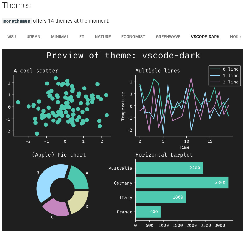
Just set the theme at the top of your script and you’re good to go. Want more control? You can still fine-tune your visuals using plt.rcParams.
import morethemes as mt
mt.set_theme("minimal")
2. pyfonts: no more stock standard fonts
Loading custom fonts in Matplotlib used to mean hunting down font files and figuring out the right file path on your system in order to load it.
With pyfonts, it’s much simpler.
Just visit the Google Fonts GitHub repo, search for the font you want (e.g. "CabinCondensed-SemiBold"), click on the .ttf file, and copy its URL with ‘?raw=true’ appended to the end.
Then load it with:
from pyfonts import load_font

font = load_font(
  "https://github.com/google/fonts/blob/main/ofl/cabincondensed/CabinCondensed-SemiBold.ttf?raw=true"
)
3. HighlightText: make your labels pop
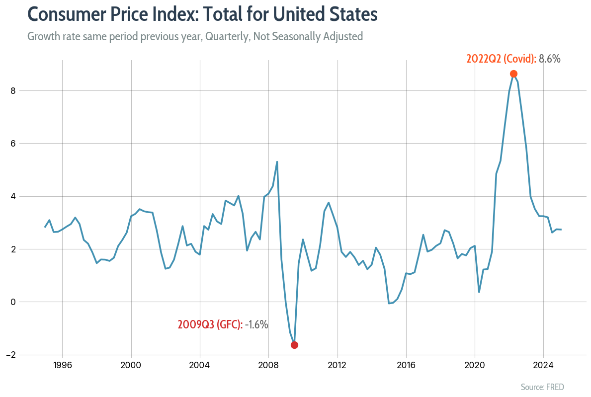
It’s increasingly common to use color-coded inline labels and annotations instead of legends. This makes the story easier to follow — see the Gestalt principle of similarity: objects that share visual characteristics are perceived as related.
The HighlightText package lets you style parts of a string — bold, color, font, size — all in one go.
For example, we can add highlight_textprops to customize the string ‘2009Q3 (GFC)’ in this annotation object for the plot below.
ax_text(
    x=pd.Timestamp("2008-01-01"),
    y=min_value + 0.5,
    s=f"<{min_quarter} (GFC):> {min_value:.1f}%", # string to customize
    highlight_textprops=[{"color": "#D32F2F", "weight": "bold", "font": title_font}], # Customise quarter and GFC string to bold and a different colour
    color="#666666",
    fontsize=16.5,
    font=subtitle_font,
    ha="right",
    va="bottom",
    ax=ax,
)
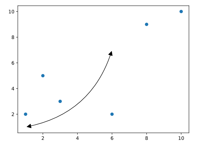
4. drawarrow: arrows made simple
Arrows are great for labelling or guiding attention to key points in your chart.
drawarrow simplifies the process of creating and customizing them in Matplotlib — double-headed, curved, wide, thin, with inflection points, and more.
Here’s a quick example:
import matplotlib.pyplot as plt
from drawarrow import ax_arrow

fig, ax = plt.subplots()

ax.scatter([1, 2, 3, 8, 6, 10], [2, 5, 3, 9, 2, 10])

ax_arrow(
    head_position=[6, 7], # head position of arrow
    tail_position=[1, 1], # tail position of arrow
    radius=0.3, # curvature of arrow
    color="black",
    double_headed=True, # arrow with 2 heads
    ax=ax,
)
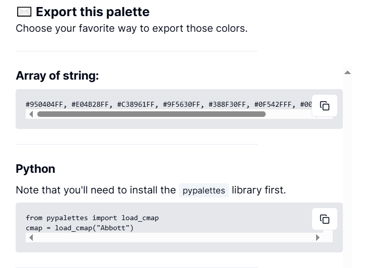
5. PyPalette: preview colour combos that work
As someone with mild colour blindness, I’m not always confident in my colour palette choices. It can be hard to tell which colours work well together.
The pypalettes package and this palette-finder tool take the guesswork out.
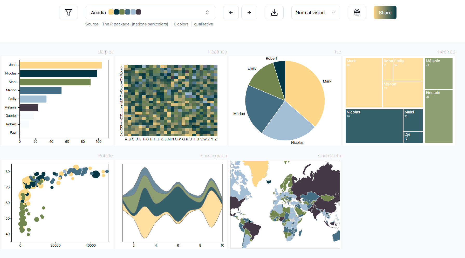
You can preview dozens of charts with curated palettes, then either:
load them directly via
pypalettes, orexport the hex codes manually and apply them using
plt.rcParams.
Key Takeaway
Stop putting up with stock-standard Matplotlib. With the right packages, you can produce publication-ready visuals that match your brand — and reuse them again and again.
Let’s work together
If you want help automating reports, building quick prototypes, or setting up AI-powered Python workflows, I’m open for 1:1 consulting. Just drop me a DM on Substack.


Great tips! Any tips on the best packages to exhibit datatables in a more "aesthetic" form? To send in e-mails, dashboards etc
love it. This can be so annoying. Even with AI writing the code, i find it's often not great at knowing dumb little things like how to avoid having arrows hit each other when labeling. I'll use these imports!