
Stop Manually Sending Data Reports Every Week
Build a Python workflow that fetches data, generates charts, and emails stakeholders automatically


Today I want to share a Python automation that I wish I had when I started as an Economic Analyst.
Anyone working with data will inevitably be required to send out regular reports to stakeholders. These reports could be in Excel, PDFs, or just in the body of an email. This can involve several manual steps: retrieving and updating data files, updating charts, updating Excel workbooks, adding some text, attaching it to an email, adding the right recipients, etc.
I used to spend about two hours a week, or 104 hours a year—basically three full work weeks—on repetitive data reports.
It’s possible to condense such steps into a single Python command and just click ‘run’.
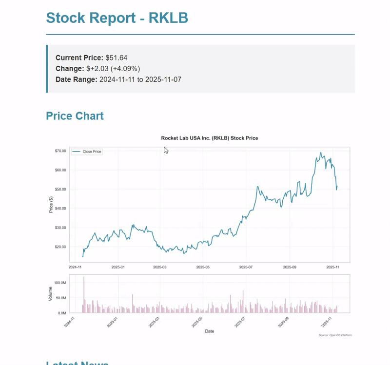
I’ll show you an end-to-end report automation, like the one above, using a simple stock price report as an example.
What we’ll cover:
Fetch real-time data from APIs (I’ll use stock data, but the pattern works for any data source)
Generate clean charts with just a few lines of code using the
seabornlibraryCreate HTML emails with embedded chart images
Attach Excel files with the raw data automatically
Send out the email without even opening Gmail
Bonus: Use OpenBB API to generate comprehensive company reports with financial metrics, fundamentals and market news
You can run the entire demo in the linked Google Colab notebook and see results in your browser and email inbox straightaway—it only takes a few minutes to set up.
Autonomous Econ is a newsletter that empowers analysts working with economic and business with easy-to-follow Python+GenAI tutorials that deliver big results.
Subscribe and join 4k+ others to work smarter through automation and solve problems that your colleagues can’t.
Get access to my Python for Econ Starter Pack site when you sign up. It includes my favorite educational resources for Python applications like dashboards, machine learning, web scraping, and GenAI.
Quick-Start: How to run the Colab notebook
Setting Up Gmail Credentials (One-Time Setup)
First, we need to configure the credentials for your Gmail account and add an app password. Gmail lets you create special “app passwords” that are specifically for automated tools like this.
Just go to your Google Account settings, enable 2-factor authentication if you haven’t already, then navigate to “App passwords” and create one for “Mail.” Copy that 16-character password—you’ll use it instead of your regular password.1
# Gmail Settings
GMAIL_SENDER_EMAIL = “your.email@gmail.com”
GMAIL_APP_PASSWORD = “your-16-char-app-password”
Note: You can do similar automations with Microsoft Outlook but it’s a bit trickier and I leave that for a future post.
Customizing Your Report (Just 2 Lines)
Once your credentials are set, there are only two lines where you need to customize the stock you want the price for and who to send it to:
# Report configs
STOCK_SYMBOL = “RKLB”  # Change this to any stock you want to track
RECIPIENT_EMAIL = “recipient_1@gmail.com”  # Who receives the report
Want to send the report to multiple people? Just add multiple email addresses separated by commas (“person1@company.com, person2@company.com, analyst@company.com”).
After setting these two parametres, you can already run the script and see it work straight away.
How it works
(1) Fetching the Data
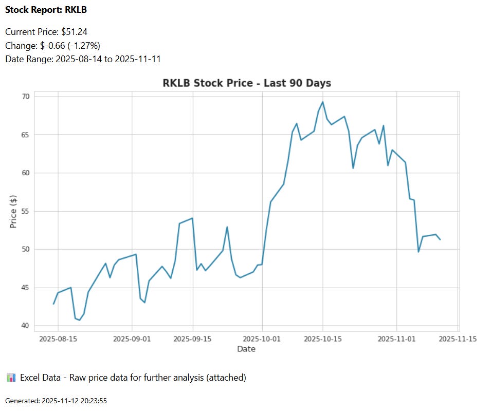
So what exactly does this automation script do? First, we have a few of lines of code to retrieve the data on the RKLB start price from yahoo finance for the last 90 days.
# Calculate date range (90 days ago to today)
start_date = (datetime.now() - timedelta(days=90)).strftime(”%Y-%m-%d”)  # 90 days ago
end_date = datetime.now().strftime(”%Y-%m-%d”)  # Today’s date

# Create a yfinance Ticker object for the stock
stock = yf.Ticker(STOCK_SYMBOL)  # Initialize ticker object

# Download historical price data
price_data = stock.history(start=start_date, end=end_date)
The code connects to Yahoo Finance’s API, pulls the historical price data, and returns it as a pandas DataFrame so it’s ready for analysis or charting.
You can find all sorts of APIs for publicly available datasets—the Federal Reserve’s FRED API for economic data, the Census Bureau for demographic data, or Alpha Vantage for financial data.
If your dataset isn’t available via an API, the trick is to start with the raw data file and then add post-processing steps in a Python function to minimize manual steps.

(2) Create the chart
We can create a professional-looking chart with minimal code using seaborn style templates, then save down the plot:
 sns.set_style(”whitegrid”)

 plt.figure(figsize=(10, 6))
 plt.plot(price_data.index, price_data[”Close”], color=”#2E86AB”, linewidth=2)
 plt.title(f”{STOCK_SYMBOL} Stock Price - Last 90 Days”, fontsize=14, fontweight=”bold”)
 plt.xlabel(”Date”, fontsize=12)
 plt.ylabel(”Price ($)”, fontsize=12)
 plt.tight_layout()
 plt.savefig(chart_path, dpi=150, bbox_inches=”tight”)
I always recommend saving charts as PNG files rather than embedding them directly in the code. This way, you have a standalone file you can use elsewhere if needed e.g. slide decks, PDFs, Slack messages, etc.
Python coding is a highly sought-after skill, no matter what industry you’re in. It’s excellent for automation and integrates smoothly with the wider data science and LLM ecosystem.
But Python also has a vast library of over 100,000 packages, which is why I put together a guide on the essential tools and resources for working with economic, financial, and business data. Check it out below.

(3) Crafting the HTML Email
This step might look intimidating, but it’s actually pretty simple.
The email body uses HTML, the same language that websites use. Think of HTML like formatting in Word or Google Docs, except you use tags instead of clicking buttons to get what you want:
<p>= paragraph (like pressing Enter to start a new line)<strong>= bold text<br>= line break (like pressing Shift+Enter)<img src=”...”>= display an image
Here’s the code for creating an HTML email with an embedded chart:
# Create HTML email body with embedded chart
email_body = f”“”<html><body>
<p><strong>Stock Report: {STOCK_SYMBOL}</strong></p>
<p>Current Price: ${current_price:.2f}<br>
Change: ${price_change:+.2f} ({price_change_pct:+.2f}%)<br>
Date Range: {price_data.index[0].strftime(’%Y-%m-%d’)} to {price_data.index[-1].strftime(’%Y-%m-%d’)}</p>
<p><img src=”cid:price_chart”></p>
<p>📊 Excel Data - Raw price data for further analysis (attached)</p>
<p><small>Generated: {datetime.now().strftime(’%Y-%m-%d %H:%M:%S’)}</small></p>
</body></html>”“”  # HTML with current metrics and embedded image reference

# Attach the HTML body to the message
msg.attach(MIMEText(email_body, “html”))  # Add HTML content to email
Notice the <img src=”cid:price_chart”> in bold? That’s how we reference the embedded chart. The “cid” stands for “Content-ID,” and it’s the secret to getting images to display inline rather than as attachments (readers are usually too lazy to open attachments).
We then assign our chart file to the “Content-ID” and tell the email to display it inline:
# Embed the chart image
with open(chart_path, “rb”) as img_file:
    img = MIMEImage(img_file.read())  # Create image attachment
    img.add_header(
        “Content-ID”, “<price_chart>”
    )  # Set ID so HTML can reference it with cid:price_chart
    img.add_header(
        “Content-Disposition”, “inline”, filename=chart_filename
    )  # Mark as inline (not regular attachment)
    msg.attach(img)  # Add image to email
Here’s what the HTML code ends up looking like in the email:
If you’re not too familiar with HTML, you can always get an AI code assistant (like Claude, ChatGPT, or Cursor) to generate the HTML code for you. You can get pretty creative describing how you want the mail to look, and it’ll write the HTML.
Step 5: Attaching the Excel File
We want to include the raw price data in Excel format so recipients can dig into it if they like. We just have to specify the file path and file name and then export it to Excel:
# Export to Excel
excel_filename = f”{STOCK_SYMBOL}_data.xlsx”
excel_path = os.path.join(”outputs”, excel_filename)

# Remove timezone for Excel compatibility
price_data.index = price_data.index.tz_localize(None)
price_data.to_excel(excel_path)
Note: the
tz_localize(None)line removes timezone information from the date index. Excel can be finicky about timezones, and this prevents any weird formatting issues when someone opens the file.
Now we attach the Excel file to the message object:
# Attach Excel file
with open(excel_path, “rb”) as f:
    part = MIMEBase(”application”, “octet-stream”)
    part.set_payload(f.read())
encoders.encode_base64(part)
part.add_header(”Content-Disposition”, f”attachment; filename={excel_filename}”)
msg.attach(part)
The MIMEBase stuff is a standard way of of attaching files with Python and handles the technical details of encoding the file properly.
Step 6: Sending the Email
Finally, we send the email by logging into the Gmail server with the credentials that we configured at the start of the script:
with smtplib.SMTP_SSL(”smtp.gmail.com”, 465) as server:
  server.login(sender_email, sender_password)
  server.send_message(msg)
What smtplib.SMTP_SSL(”smtp.gmail.com”, 465) does is connect to Gmail’s server using Port 465 as the secure connection.
And that’s it. The entire workflow—from data retrieval to email delivery—runs in about 5 seconds.
Real-World Applications and Extensions
This workflow is highly adaptable to different data reporting processes.
Instead of stock data, you could pull:
Economic indicators from FRED (GDP, unemployment, inflation)
Sales data from your company database
Web analytics from Google Analytics API
Social media metrics from Twitter/LinkedIn APIs
Weather data for agricultural reports
You could also point the report to a CSV file instead of the API-requested data. For example, if your data team drops updated files into a shared folder every day, you can set a trigger to run this script whenever the dataset is updated.
I covered scheduling options in a previous post:

This workflow is your gateway to other Python productivity hacks. The skills you’ve learned here (API data retrieval, chart generation, HTML email formatting, and file attachments) form the foundation for virtually any report automation workflow.
If you want me to cover any extensions of this in future posts, let me know in the comments. Anything from multi-plot reports and PDF attachments to integrating with LLMs to write executive summaries of your data automatically.
Consider upgrading to a paid subscription and expensing it through your work—it's a great motivator for me to keep investing energy into these posts.
The core of my articles is free to read, but paid subscribers get exclusive perks—bonus code templates and in-depth explainers designed to set your work apart.
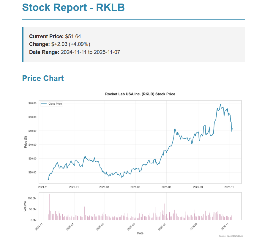
Bonus: Extended Workflow with Comprehensive Market Data
For those who want to take this to the next level, I’ve created an extended version with a more professional-looking email.
This enhanced version uses the OpenBB Terminal API to extract comprehensive financial market data. OpenBB is like Bloomberg Terminal but open-source, aggregating data from dozens of providers into a single interface.
The result looks like something a research analyst would spend an hour creating, but it runs in seconds on autopilot.
Here’s what this extended script automatically generates:
📊 Price Charts - Historical price data with volume subplot showing trading activity
📈 Key Metrics - P/E ratio, ROA, ROE, Debt/Equity, Profit margin, market cap
📰 Recent News - Latest articles and company announcements from multiple sources
💼 Fundamentals - Income statements, balance sheets, and cash flow statements
📁 Excel Export - Multi-sheet workbook with all data organized by category
📧 Email Delivery - Professional HTML email with embedded charts and summary text
The full script below also walks you through how to schedule the script to run daily on autopilot with Windows Task Scheduler or Mac cron jobs.
Keep reading with a 7-day free trial
Subscribe to Autonomous Econ to keep reading this post and get 7 days of free access to the full post archives.